Our project focuses on creating a responsive website that revolutionizes childcare and tutoring services for busy parents. Understanding the challenges of balancing demanding schedules, we aim to provide a user-centric platform that enables flexible, last-minute booking of trusted nannies and tutors.
My contribution:
Initiated and organized a self-led remote team project to build a babysitting platform from the ground up.
Led and facilitated weekly Zoom meetings to monitor progress, align on goals, and support team collaboration.
Set up and managed a dedicated Slack workspace to facilitate daily communication, share resources, and keep the team aligned asynchronously.
Actively contributed across every stage – from user research and problem framing to ideation, wireframing, and visual design.
Promoted a collaborative working culture, ensuring shared ownership and consistent communication throughout the project
Project Problem Statement:
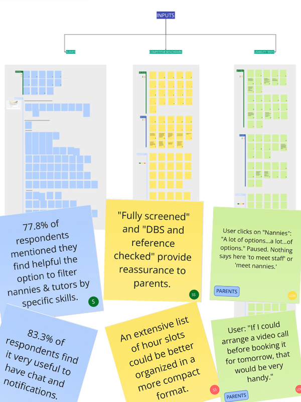
Following the completion of two user surveys, six competitor benchmarks, and six usability tests, we identified key problem areas in the current market landscape:
Information Overload: Users feel overwhelmed by cluttered menu options and inconsistent filters.
No Peer Support: Parents struggle with decision-making without access to other users’ experiences or community forums.
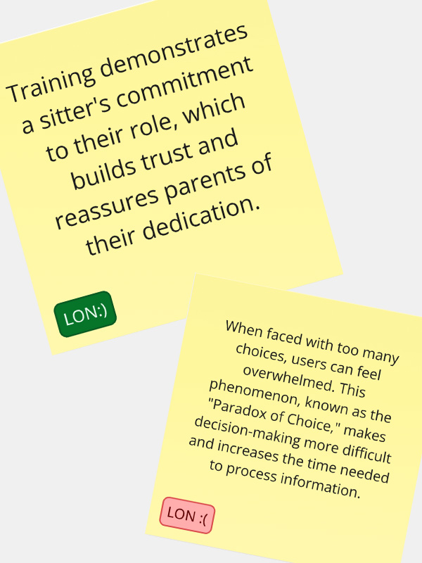
Lack of Trust Signals: Users are hesitant to book due to vague reviews, unverified credentials, and generic bios.
Project Goal
To design a trustworthy, user-friendly babysitting platform from scratch that eliminates information overload, fosters community support, and builds user confidence through verified care experiences.
STEP ONE: RESEARCH
We began the project by designing and distributing a user survey to uncover key pain points and positive experiences related to babysitting websites.
Read More
This initial research phase allowed us to identify recurring user frustrations—such as unclear booking processes or lack of trust indicators—as well as features users appreciated, like detailed sitter profiles and responsive communication tools. These insights informed our design direction from the outset.
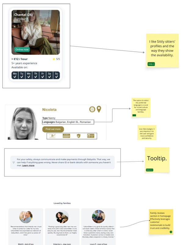
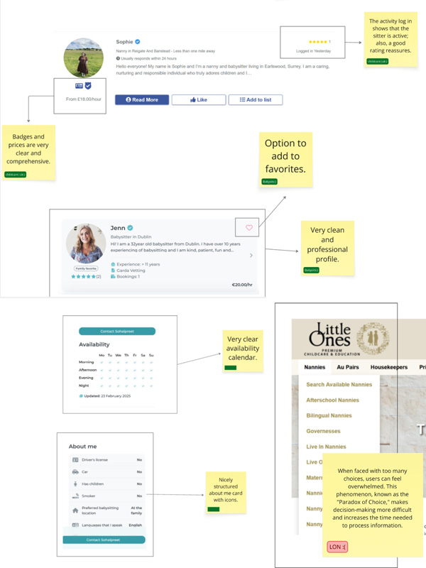
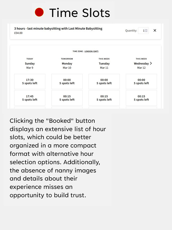
To deepen our understanding, we conducted a competitive benchmarking analysis of six babysitting platforms across three countries: the UK, USA, and the Netherlands. This allowed us to evaluate common design patterns, feature strengths, and areas for improvement across different markets.
Objectives:
• Understand Industry Standards • Identify Strengths and Weaknesses • Set Clear Goals • Enhance Customer Experience • Innovate and Differentiate • Improve Efficiency
STEP TWO: ANALYSIS
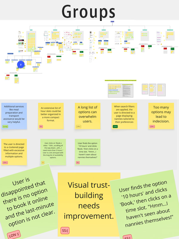
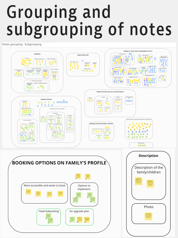
Affinity Diagram
This method allowed us to visually cluster insights from user feedback, revealing overlapping themes and unique needs specific to each group. The findings provide a clear foundation for designing more user-centered solutions that resonate with both sides of the platform.
Read More
This method allowed us to visually cluster insights from user feedback, revealing overlapping themes and unique needs specific to each group. The findings provide a clear foundation for designing more user-centered solutions that resonate with both sides of the platform.
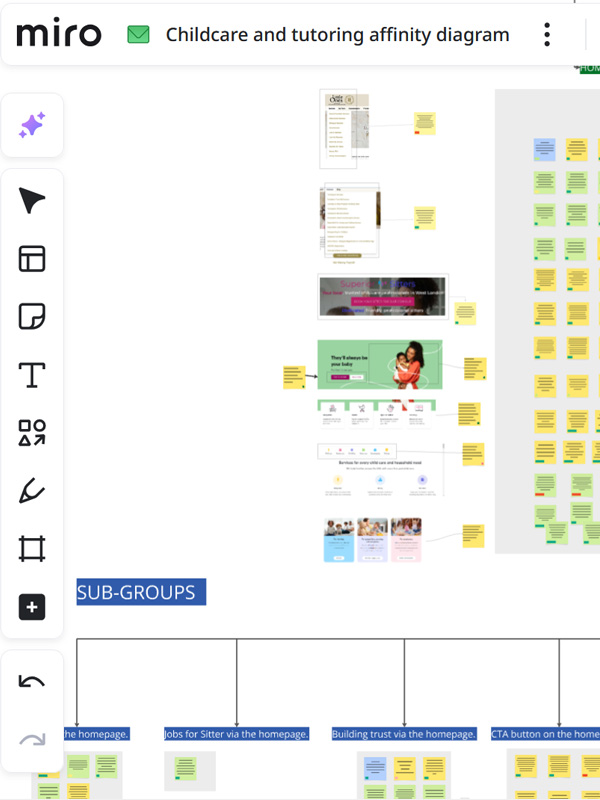
Customer Journey Map
Customer Journey Map Overview.
The goal of this Customer Journey Map is to clearly convey key touchpoints of the user’s experience, enabling viewers to quickly understand their needs and emotions.
The customer journey map is presented on a Miro Board.
The research comes from two online surveys, competitive benchmarking across six platforms that connect sitters and families, and notes from three usability tests, organised and analysed using an affinity diagram.
Field: platform that connects babysitters and families.
STEP THREE: CONCEPT
User flow & Interaction sketches
STEP FOUR: DESIGN
Moodboard
Colour Palette and Typography
After aligning on the brand values and target audience for our babysitting platform, we moved into the design phase with a focus on visual clarity, emotional warmth, and user trust. The first milestone was selecting the colour palette and typography:
Brand Colours:
Raspberry Red
Trustworthy Blue
Background Colour
Card Backgrounds & UI Elements
Typography:
H1 – McLaren
H2-H6 – Urbanist
Text – Poppins
Quotes – Italic Urbanist
Logo Design Process
Our logo was crafted in Adobe Illustrator using vector precision to ensure scalability and clarity across devices. It incorporates our two brand colours: Trustworthy Blue #1E71B8 and Raspberry Red #AC164D – to embody the platform’s blend of reliability and warmth.
Reusable Components
From Wireframe to Final Design
Starting with low-fidelity wireframes, we focused on mapping user flows and layout hierarchy to ensure intuitive navigation. These structures evolved into high-fidelity designs through iterative styling, responsive component creation, and consistent application of our brand identity, transforming raw concepts into a polished and cohesive user interface.
You’re welcome to explore my other two projects by selecting either option below.
Road Star Rentals - car rental website
This website was built to simplify car bookings-cutting out clutter and focusing on speed, clarity, and ease of use.